Project
Master's thesis in Interaction design - in collaboration with HiQ
Tools
Figma, Miro, MetroRetro, Google Forms, Zoom
Role
Me and my thesis partner worked with the whole design process - from research to designing and testing
"What should be considered when designing an application which solves both the problem with lack of social interaction and lack of physical activity?"
Process

Discover
Focus: gaining more knowledge about what the problem actually is
Define
Focus: narrow down the insights that have been gathered
Develop
Focus: explore and ideate on answers to the defined problem
Deliver
Focus: test and evaluate solutions created in the develop phase
Background
During the Covid-19 pandemic people have been affected negatively, lacking both social interaction and physical activity. The aim of this project was therefore to encourage remote socializing as well as physical activity by identifying guidelines for how to design an application that intends to solve this problem. Furthermore, the aim was to design and prototype a suggestion how such a solution might look.
The initial idea presented by HiQ was to design something for people to participate in remotely while moving around, sharing a common experience.
Researching
Before starting the user research we wanted to get a deeper understanding of how communication between people works, as well as what is the difference between communicating face to face, through video calls, and through voice calls. It was also important to investigate the effects of working remotely, and how physical activity can affect people.
Further, we conducted a benchmarking to investigate what is already on the market relating to physical activity and socializing remotely. We found that most products focus on one of these aspects, but not both of them together.

Understanding the problem
In order to understand people's experiences during the pandemic we investigated what they miss, what they want and what is important to them when it comes to social interaction and physical activity. This was accomplished through questionnaires and interviews.
Findings
People want to be more physically active than they are at present.
Socializing through an activity and not just talking is appreciated
People have an increased acceptance for socializing remotely through video or voice calls
Narrowing it down
The many answers received from questionnaires and interviews had to be compiled and analyzed using the KJ method. We created personas based on this analysis to more clearly visualize what the needs of the users are. We also set up a requirements specification with necessary and desirable needs that should be met by the design.
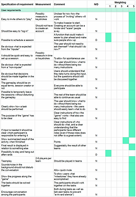
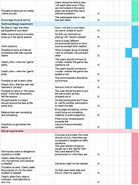
Requirements specification
Requirements specification
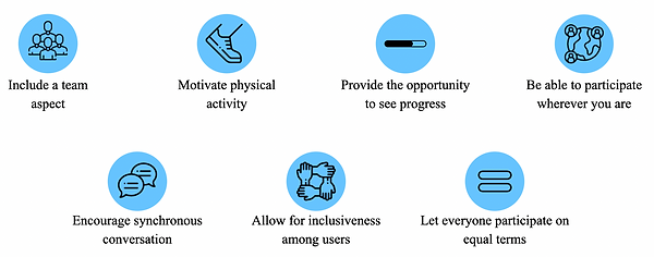
Guidelines
Based on all findings from the user research, together with insights from benchmarking and literature review we identified 7 guidelines that should be considered when designing to encourage remote socializing and physical activity.
Icons made by Freepik and Smashicons from www.flaticon.com
Exploring and ideating
After the guidelines were identified our goal was to create a design as an example on how these guidelines can be implemented in a real concept. We therefore held a brainstorming session to come up with as many ideas as possible.

Brainwriting
Evaluating
This first iteration was evaluated with a verbal PNI (positive, negative, interesting) in order to compare the ideas against the requirements set up previously. This resulted in moving forward with the idea of designing a remote quiz walk for teams, with a twist.
Defining the flow
With the main idea set we wanted to get a clearer overview of the different steps the design should contain. This helped us break the design down into smaller sections, brainstorming on each separately.

Ideating on each step
The brainstorming sessions led to many different ideas, but due to the time limits of the project we could not develop all of them. Therefore we used a morphological matrix to extract 4 concepts to keep working on. By randomly combining sub-functions three concepts were generated. The fourth concept was based on which sub-functions we thought would be the best - our "dream concept".

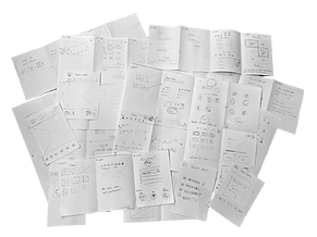
Lo-fi prototyping
When the four concepts had been generated it was time to start sketching with pen and paper on different solutions. During the prototyping we realized that we needed to bring in users to give their opinion on some of the functions since these would lay the foundation of the whole product. Therefore, we also created some lo-fi prototypes in Figma to be able to ask users remotely.


Testing with users
We wanted to get input from users regarding three different functions: receiving questions, reward for a correct answer, and how to input an answer. The users were asked which idea of receiving questions they thought would contribute most to the social interaction and which one they thought would be the most fun. We also wanted to know what kind of reward for answering correctly they would find most interesting and if they preferred to answer in free text or choose from alternatives.
Insights and findings
All users thought that betting points on each question would be the most fun and contribute to the social part
The most liked reward was to receive a picture clue leading up to a final task or question at the end
There are too many disadvantages with free text input, and choosing from alternatives are preferred
Defining the phases of interaction
To get a better overview of what each step of the interaction would involve in general, we created a user journey map. This gave us a clearer understanding of what elements were needed on different pages, as well as what interactions should exist "backstage".

Developing two concepts
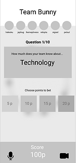
Based on the input from users we decided to prototype two different concepts, each having its own main focus. The first one focused on betting points on each question, whereas the second concept evolved around the idea of receiving picture clues for a correct answer. The underlying idea was that each choice would be discussed in the team but only one person could make the input at each question. One of the main points of the test was to investigate whether users would understand this. In order to test the flow of these mid-fi prototypes they were also made partially interactive.
Betting
Clues

Evaluation with users
The aim of this evaluation was to test different ways of visualizing how to advance in the game, using different kinds of maps. We also wanted some insights into which concept was preferred by the users and to test the interactive parts of the prototypes. This was complemented with a Heuristic evaluation-inspired questionnaire.

Results
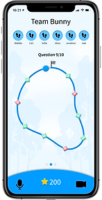
Users prefer the more abstract fictional map over the real map. However, it should not be completely round, as this can be interpreted as time, or too irregularly formed, as this makes it harder to see the progress. There was no clear preference of one concept over the other, but due to lack of time we chose to continue with the betting concept since this was more developed at this stage of the process.
Final concept
When developing the final concept we started with creating an inspiration board. This helped us get a common understanding of the theme and feeling of the concept. We also set a style guide including color scheme, iconography and text font. Here, the different states of the buttons were set as well.

Style guide
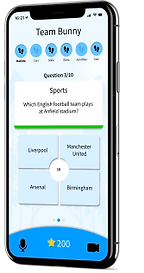
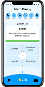
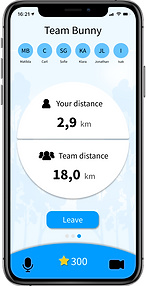
In the final design the users can either join a session or create a new one with up to six players. When having entered the session and everyone in your team is ready, you can start the game. Both camera and microphone is included to allow players to talk to each other during the whole session. By collectively walking a certain distance the team unlocks new questions, meaning that not everyone has to walk equally fast. The team should then together decide how many points they want to bet considering the category that has been given to them. When this choice is made you receive the question which should once again be discussed in the team before answering. When having answered all questions the game is finished and the team is presented with a leaderboard displaying their result in relation to other teams having played the game. During the whole game it is also possible to see how far you have walked yourself, as well as the total distance of the team.


Evaluation
The final concept was evaluated with users who either was asked to create a new session or to join one, inspired by the Cognitive walkthrough. Based on the users interaction and feedback we concluded that the way of showing who should do the input still needs to be developed further. The difference in affordance, along with the text shown on the screen was not enough for users to understand that they could not make the input on every question. The possibility to swipe between different pages was also not clear to the users. However, this could possibly be explained by the tests being performed on a computer, a device on which this interaction is not used.
Low affordance when you are not the inputer


The general feedback from the users was that they really liked the prototype, asking if it would be implemented and released. Thus, this shows that we are on to something good, hopefully being able to encourage remote socializing and physical activity among those who use it.
Challenges
A challenge in this project has been to evaluate the design. Due to the pandemic and the fact that the concept is bound to a specific context some parts and functions have not been tested in a realistic way. The team aspect was simulated by us acting as the user’s team mates, but if testing with several people at once this would have given a better understanding of how well it works.
Due to the pandemic we had to perform most tests remotely, leading to the tests being performed on a computer and not on a mobile phone, which is the intended device. However, we handled this situation by giving the users control of our computer mouse, at least making it possible for them to interact with the prototype themselves.
The product is intended to be used outdoors, and with that comes a lot of other factors that we have not been able to test for in this project. Surrounding factors as sound, other people and light conditions all affect the experience and interaction possibilities. During the evaluations we asked the users how much attention they think the product demands, imagining themselves using it outdoors. The response to this was that it does not demand much attention, but to confirm this, outdoors tests are needed. This is also an ethical aspect as the design should not put the user in dangerous traffic situations.
Insights and learnings
Users know their stuff
I already knew that users' opinions are very important, since they are the ones designed for. This, however, became even more apparent in this project. We did not consider the betting to be the best idea, but the users did not agree, in fact, during the evaluation all users thought this idea of receiving questions was the best.
More experience using tools like Figma
During the project I got to spend a lot of time designing in Figma, learning more advanced tools and realizing the importance of creating a set of components.
The concept does not need to be all thought out before testing
Parts of a concept can be tested even if the rest of it is not finished. For example, we tested ideas for what the main activity would be while the set up phase was not prototyped yet. Thus, you don't need the whole flow of interaction to get good input from users.
Problem solving
Since we could not test the prototype physically with users, we had to come up with another way of performing the tests in the best way possible. This resulted in us sharing the screen with the prototype through Zoom, and giving the control of the computer mouse to the user.