


SSRS - Eyes on scene


Project
Collaboration between Infotiv and Swedish Sea Rescue Society (SSRS)
Tools
Figma
Role
UX designer
"Design a new control interface with which the user can control the drone launcher"
Background
This project is a collaboration between the Swedish Sea Rescue Society and Infotiv. Together we are developing a drone system which should provide the sea rescuing personnel with valuable data regarding the accident. This will provide the personnel with information of what rescue gear to bring before going out to the scene of accident.
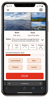
To be able to fire the drone in a safe way the user must be able to control the settings of the drone launcher. This is done through the use of a web interface. However, this interface needed some updates to be more simplistic, user friendly and visually pleasing.
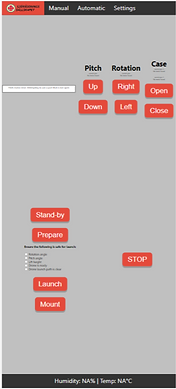
Previous design of the control interface
Initial sketches
Based on information from SSRS, I created some wireframes in Figma. By doing this I could see what components should be included as well as the space they would take up on the screen.
Prototyping
After getting some clarifications of some of the functions from SSRS I created mid-fi prototypes. Here I started adding some colours and also made some interactions between different parts of the interface.
During this part of the project I communicated with the product owner and developers to discuss how to solve some design challenges. One difficulty was to fit everything one the screen without the need for scrolling, which was set as an initial requirement. This was solved by tightening some components and using an expandable status message - making the page scrollable only if this message was axpanded by the user.

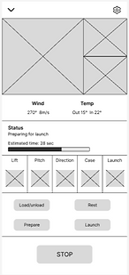
Final design
For the final design I created a design system and colour scheme. The colour scheme was set based on the criteria that the user should be able to use the interface outside, in different light conditions. The red colour can also be found in the logo.
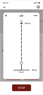
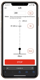
The design consists of a main screen where the user can control the main functions of the drone. Here the user also receives camera feeds and status messages. To make some more specific settings the user can click on the relevant function.

Design system and colour scheme


Challenges
One of the requirements that was set at the beginning of the project was that there should be no scrolling. However, with many components there was little space left for fitting a satus message that could sometimes be 11 lines long. Together with the product owner and developers we came up with the solution that the status message should only be displayed in 2 lines and that the user should be able to expand it if they wanted to see more. However, the page should expand downwards and behind the stop button, since another requirement was that the stop button should always be visible.
One challenge was related to the requirement of the stop button always being visible. The user should be able to make some specific settings to a function by setting a value manually. However, when doing this the keyboard is opened, covering the stop button. This led to a discussion of whether the user should be able to set the value to only a few specific steps without needing the keyboard, or give the user more freedom but cover the stop button. Toghether with the product owner and developers we decided that the user freedom is important and set up a new requirement that the launcher should not move while the keyboard is open.